Saturday, May 13, 2017

Whiptail

I'm so sorry that I had this misunderstanding.

Below is the link to our final site:

https://comm3560.wixsite.com/whiptail

For this project, I did the logo design and the style guide. Ashlee Gallegos did the social media, Erin Smith did the advertisements, and Erin Hakoda created our website. I think that we all did a very good job at communicating and working together in order to get it done on time and make everything look good.

While creating the logo I thought a lot about what I, as a mountain bike enthusiast, would be attracted and drawn to when looking for a good biking company. I did research on other biking company logos as well as just logos in general and what follows good design techniques as well as represents the company well. I think that the final logo we chose is a perfect fit for our company because it is very simple, which is the style recently, and it also has a fun, playful vibe to it which is fitting for a biking company.

Below are some images of the process I went through in order to design the logo.
This image is of our first comprehensive that me and Erin Smith both worked on. You can't see all the details up close (following are close up images of the process) but this is a good example of what a designer goes through in order to create work. It looks like a mess but it shows how we experimented with lots of different colors, typefaces, and design concepts.


Below is some close ups of the process and experimenting with fonts and colors.


In order to create a good, eye-catching icon for the logo we took a lot of different design concepts and tried lots of different things until we felt like we had something that was perfect for our company. 

Final logo:

 Final Styleguide:

Design Analysis: 

My logo design incorporates a few of the Gestalt principles of design including simplicity, continuity and closure. Obviously this logo design is very simple which I think is very attractive and eye catching. Continuity is used in the gear that surrounds the lizard in the icon of the logo as well as in the fonts throughout our website and our ads. Erin did a really good job at making the website flow and use a lot of design techniques that makes it look amazing.  The spokes on it create a very interesting pattern that leads the eye around the whole icon. Closure is used in the cutout of the lizard, The eye finish the shape where the tail is missing, and it is easy to comprehend what the two shapes are. Contrast was a very big thing that we focused on with our logos and pictures, we made sure all the wording and logos were placed on images that would make it stand out. 

Balance is a big part in every design, I think everyone in our group incorporated good balance into our designs. As I created the logo I wanted it to have good balance, I thought about putting the icon in front of the words but it wasn't balanced as well as I wanted it so I switched it up. 

All of these principals are very important when designing anything. 

Tuesday, March 21, 2017

Compose your Frame
I chose this photo that I took while at the sand dunes in Hurricane. I chose it because I think it demonstrates a lot of different photography rules. It uses the rule of thirds with the dark ground, the clouds, and the blue sky. It also has a few diagonal lines in the mountains and clouds. The lines of the mountains lead your eye to the razor and the girl. The shapes on the Razor create small vectors and makes the image interesting because all of the shapes aren't organic.

Wednesday, February 15, 2017

Typography:

As a designer, typography is one of the most important parts of design. You can have an amazing design and use the wrong font, not even a bad font but just the wrong font, and you can ruin the design; typography can be a very challenging part of design. Over the years I have been in school, I have learned a lot about type and I think that I am becoming better at choosing font styles that fits my design. I tend to use very simple fonts such as helvetica, museo sans, and museo slab.
I have very simple style so these type of fonts are something that appeals to me. I think that a lot of fancy serif fonts can take away from a design.

Thursday, February 2, 2017

Good and Bad Design:


Good Design!
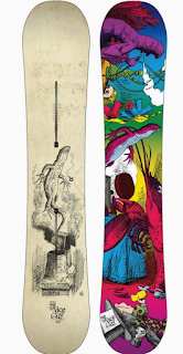
I wanted to do snowboard graphics because I have a lot of experience with this field. I interned for two different snowboard companies and when I graduate I want to continue to work with snowboard companies, hopefully designing graphics for them. The graphics for this snowboard are something that I would say has a lot of good design elements. We all have different style so some of you might not completely agree with me one of these designs being better than the other. I love this snowboard design because it has a lot of good design elements that stand out to me. 
  •  Color is a huge part of design and I love the colors on this, the bottom of the board is very eye catching because of the complimentary blue and orange that they used on it. The top of the board obviously has a lot more colors being used but it still has good color combinations and a lot of complimentary colors used near each other. This design also has a lot of balance and harmony within it. And the bottom of the board similar design elements with the top designs which is very important for snowboard design. 
  • The top of the board (left) has a symmetrical design both horizontal and vertical. Not all good designs are this symmetrical and a lot of bad design is symmetrical so doesn't determine whether or not a design is good but this one happens to work really well.
  •  Another design element that makes this design work very well is the way that the eye moved along this design, it is very intriguing to me. 
Bad Design!
In my opinion this snowboard has so many bad design elements within it but there is a possibility that some people would prefer this design over the first one. 
  • The first thing that I think is wrong with this design is the fact that the top and the bottom don't go good together. It has the same character of the lizard in both graphics but the colors and style makes it look very unpleasant.  It needs to have better symmetry between the two designs. The color schemes within the top design and the bottom design is terrible in my opinion, not only do they not go together, they are not my style. 
  • There is a big difference between asymmetric design and design that just confused the eye. When I look at the bottom of this snowboard (right) I don't know where to look, it is all too busy and it doesn't lead your eye along a path like the other design we talked about does. 
  • The spacing within the design on the top of the board is super weird, it doesn't really fit the law of thirds the graphic just feels like it was thrown on there in a random spot. I don't see any contrast in composition in these designs.  


Thursday, January 26, 2017

Gestalt Presentation:

Law of Closure:


Law of Continuity:

Law of Pragnanz:


Wednesday, January 25, 2017

Contrast, Balance, and Harmony:
I think that this design inspires me so much because I have taken a lot of classes that have taught me about contrast, balance, and harmony and what creates these characteristics in a design or a piece of art work. When I saw this design I automatically thought that this would be a good example for this assignment. The balance in this design is easily noticed for me because I have learned that dark colors (such as the bottom part of this design) balances out the top part of the design with has a lot of detail in it compared to the bottom. This technique works because it equally draws the eye to the top and bottom of the design. The highlights and shadows in this design also creates a lot of contrast with the colors used on the top portion of the design as well as creating interesting shapes that keep the eye flowing throughout the design.  The design in a whole, according to me, has a lot of harmony and intrigues me.

Wednesday, January 18, 2017

This design gets me! It is a band poster that was created in 2014 by Billy Bauman. I really like the style of concert posters like this one because of the color schemes that are used for things like this. I think designs like this one that make you feel a certain way can be considered successful. I think the main thing that makes me love this is definitely the color scheme, this has really good contrast and balance. I love the diagonal lines that lead the eye to different parts of the poster. I also really love unexpected artwork like this poster. It takes a lot of creativity to create something that you have never seen before. The forms in this design are very intriguing for me because it is broken up in a very interesting way. I like the textures that makes it look like it is vintage and the intricate design around the circle at the bottom.  The light colors and the dark colors are perfectly spaced in my opinion which creates a balance that makes this fun to look at. I think everything in this poster is amazing!

Monday, January 16, 2017

Intro

Hey y'all!  It's Haylie. I am a senior at Dixie and a Graphic Design Major, along with three other students in the class. I'm from the small town of Santaquin, Utah (if you're wondering where that is, it's 20 mins south of Provo). I love to create art, design, and almost anything with my hands. I love to snowboard, mountain bike, wakeboard, play soccer, and slack line. Wow, life is good here in STG. I have loved going to school here and I'm excited to move on and see where life takes me. I'm excited to get to know all of you.