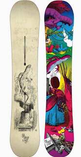
Good Design!
I wanted to do snowboard graphics because I have a lot of experience with this field. I interned for two different snowboard companies and when I graduate I want to continue to work with snowboard companies, hopefully designing graphics for them. The graphics for this snowboard are something that I would say has a lot of good design elements. We all have different style so some of you might not completely agree with me one of these designs being better than the other. I love this snowboard design because it has a lot of good design elements that stand out to me.
- Color is a huge part of design and I love the colors on this, the bottom of the board is very eye catching because of the complimentary blue and orange that they used on it. The top of the board obviously has a lot more colors being used but it still has good color combinations and a lot of complimentary colors used near each other. This design also has a lot of balance and harmony within it. And the bottom of the board similar design elements with the top designs which is very important for snowboard design.
- The top of the board (left) has a symmetrical design both horizontal and vertical. Not all good designs are this symmetrical and a lot of bad design is symmetrical so doesn't determine whether or not a design is good but this one happens to work really well.
- Another design element that makes this design work very well is the way that the eye moved along this design, it is very intriguing to me.
Bad Design!
In my opinion this snowboard has so many bad design elements within it but there is a possibility that some people would prefer this design over the first one.
- The first thing that I think is wrong with this design is the fact that the top and the bottom don't go good together. It has the same character of the lizard in both graphics but the colors and style makes it look very unpleasant. It needs to have better symmetry between the two designs. The color schemes within the top design and the bottom design is terrible in my opinion, not only do they not go together, they are not my style.
- There is a big difference between asymmetric design and design that just confused the eye. When I look at the bottom of this snowboard (right) I don't know where to look, it is all too busy and it doesn't lead your eye along a path like the other design we talked about does.
- The spacing within the design on the top of the board is super weird, it doesn't really fit the law of thirds the graphic just feels like it was thrown on there in a random spot. I don't see any contrast in composition in these designs.


No comments:
Post a Comment